
Published on July 17, 2017
5 min read
Redesigning GitLab's navigation
After a series of research and brainstorming sessions, we are excited to share with the community our redesign of GitLab's navigation.

At GitLab, we are taking big steps towards refining our interface in an effort to make the idea to production workflow more productive. After a series of research and brainstorming sessions, we are excited to share with the community our redesign of GitLab's navigation.
Research and insight
Back in March, we began our first of three rounds of user testing related to our navigation architecture. We knew from previous feedback that navigating GitLab's features was complex, difficult, and could be drastically improved. One of the major pitfalls we discovered in this round was confusion between global content vs. contextual content for new users when navigating. This was a large source of frustration when trying to find projects, or distinguish between your personal space and memberships.
-
Global content refers to the elements that are always available to you. Example: Your projects, issues, merge requests, and explore sections.
-
Contextual content refers to the elements that change based on the page you are viewing. Example: The content of an individual group page vs. a project page.
Using the data we gathered from our first round of testing, we began putting together common themes. This allowed us to gather questions and assumptions, which informed our next prototype to test from. Our research team created a script that would walk users through a number of tasks. This script was then used to help us validate the assumptions we had made in our brainstorm session.
{: .text-center}
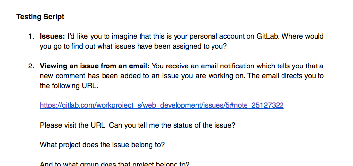
We wrote up our findings from this round, identifying problem areas through the insight we gained by watching real users interact with our prototype. The team then set out to create a new design that addressed the interaction flaws we had identified during our testing.
Further discovery
Through a series of brainstorm sessions, the team created two new prototypes to use in testing. During this round of testing, six users were shown Prototype A and another six were shown Prototype B. Each prototype used the same series of tasks, allowing us to track usability issues from each prototype individually, as well as compare the average time taken per task.
Prototypes A and B
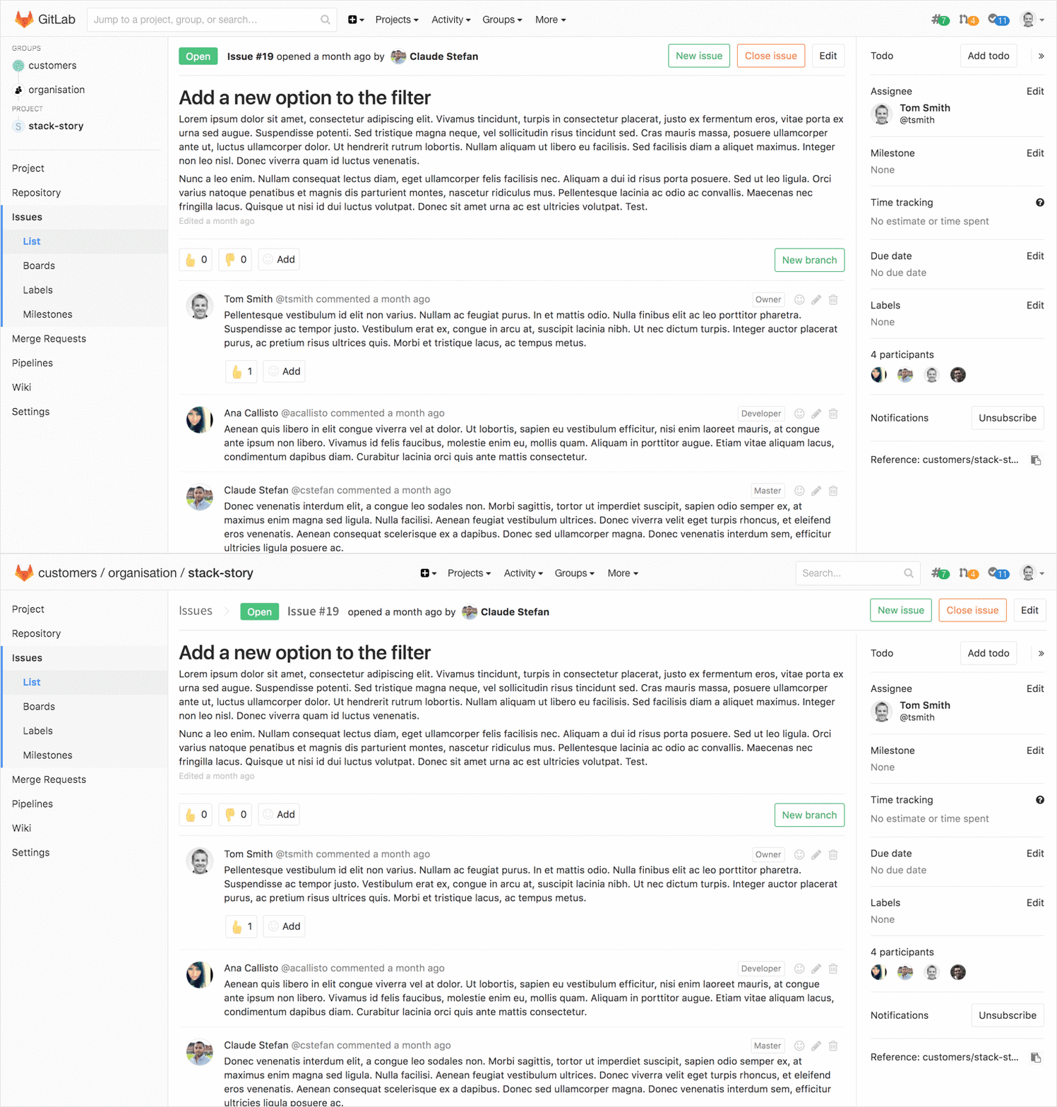
During this third round of testing, we discovered that the majority of users were able to identify the difference between their global content from their contextual content after a few completed tasks. This was an improvement from our previous research which showed that users could finish a usability testing session without gaining an understanding of global vs. contextual content.
A shippable product
From the data we gathered in our third and final round of testing, we began putting together a design that could be shipped in our 9.4 release. We took the most successful aspects of both prototypes and created a mockup that addressed the major pain points we discovered during all of our testing.
We knew from previous feedback and from our research that including the global navigation links on the top navigation bar was superior to hiding them in a hidden hamburger menu. Openly displaying them in the top navigation allows users to easily and quickly access the information that they revisit often.
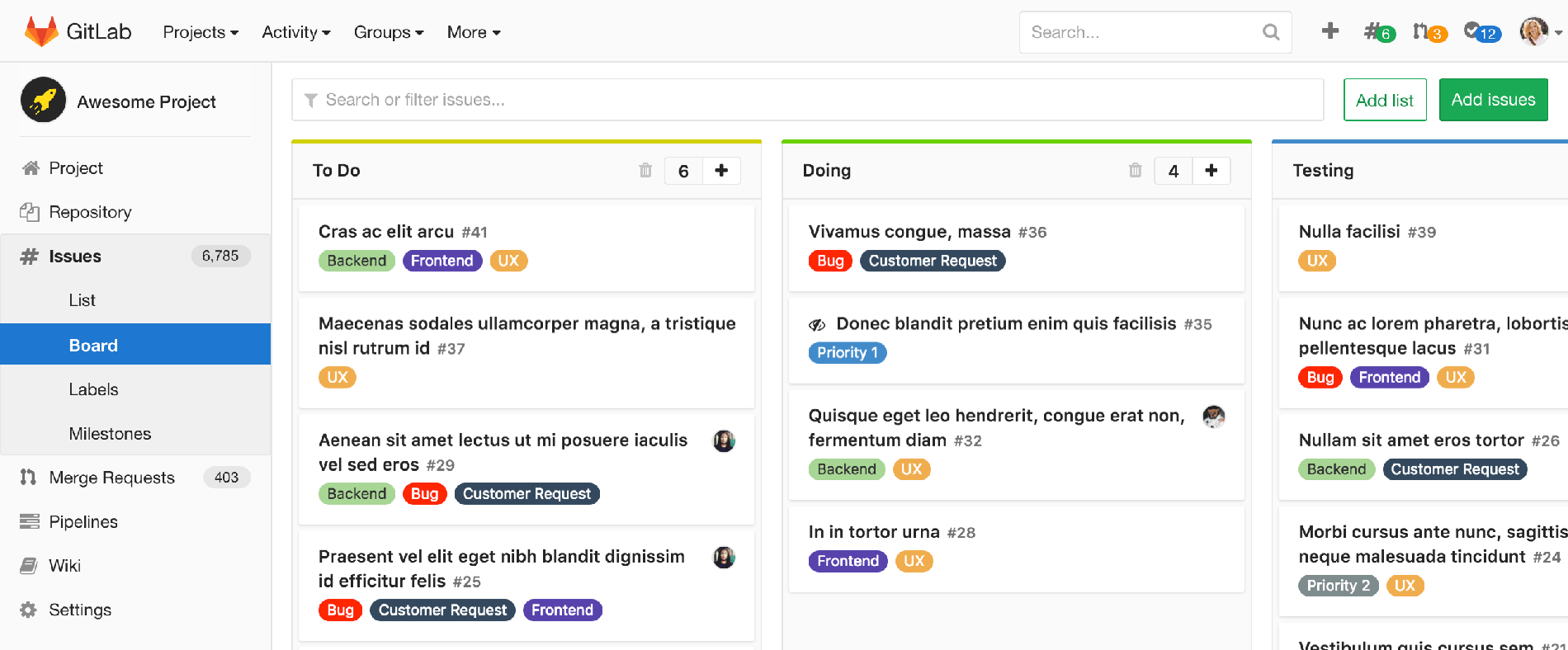
We also learned that including a standard breadcrumb menu helped users orient themselves. It became much easier for new and seasoned users to understand where they were located and navigate up a level.

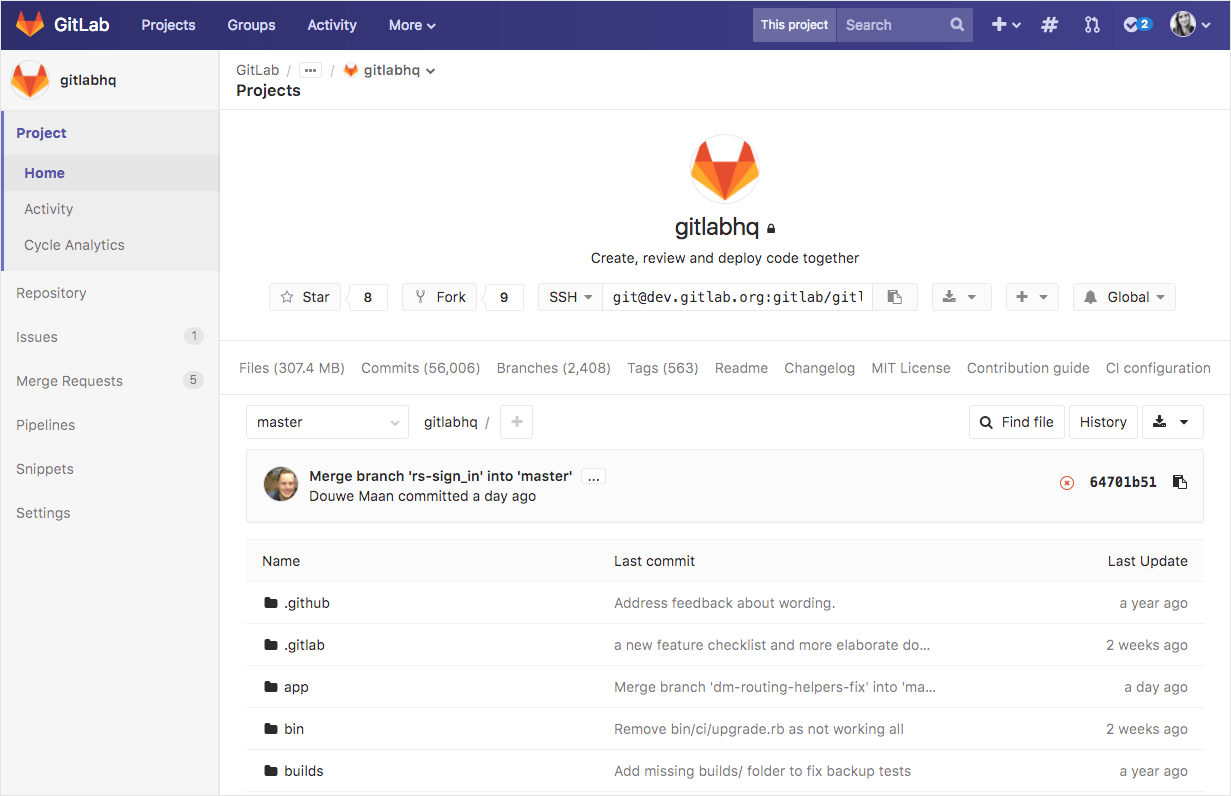
Key experience decisions like these gave us a base for finalizing the foundation of the redesign. Afterwards, we began to take a closer look at the interface, add color, and define different states. Color played a key role in not only giving GitLab its own look and feel, but also further differentiating the global content from the contextual. We worked through many iterations, until we nailed down an interface that used color as a guide and not as a distraction.
Continuing to iterate
We are excited to share our progress with the community and even more excited that this is just the beginning. There are a number of improvements that we are working on in order to further improve our navigation. A few of these features include:
- Adding a fly-out drop down to the contextual navigation, making it easier and faster to reach sub menu items. #34026
- Make the contextual sidebar collapsible to allow for more screen real estate. #34028
- Adding multiple color palette options for differentiating instances. #35012
- Adding content to global navigation dropdowns to allow easier access to recent projects and groups. #35010
- Adding the contextual navigation on mobile devices. #34036
You can see our current list of issues planned for 9.5 in our Meta: Global and contextual navigation issue.
Try it yourself
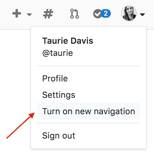
We know that a UI change as large as a navigation redesign can be disruptive to workflow and habits but we hope that you will find GitLab much easier to navigate in 9.4! We actively worked to turn research and analysis into insight that would inform a more productive navigation architecture for GitLab. We have a number of improvements to make, and are including a way to turn the new navigation on and off while we continue to gather feedback and iterate in the next release. To turn the new navigation on, click your user profile dropdown and select "Turn on new navigation" or visit your user preferences.
{: .text-center}
Feedback
After several rounds of UX research and taking into account the feedback received from the community, we believe we have a UX solution that greatly improves navigating GitLab. In addition to the roll out in 9.4 and the scheduled improvements for 9.5, we have created a feedback issue to collect, track, and act upon further feedback from the community. We would love to hear your thoughts so don't hesitate to leave us a comment below or in the issue!
We want to hear from you
Enjoyed reading this blog post or have questions or feedback? Share your thoughts by creating a new topic in the GitLab community forum.Share your feedbackFind out which plan works best for your team
Learn about pricingLearn about what GitLab can do for your team
Talk to an expert