Published on June 15, 2018
8 min read
Meet the GitLab Web IDE
Here's how we went from a proof of concept to a new feature that makes it even easier for everyone to edit inside of GitLab.

GitLab has been doing much more for the application development workflow than just source code management and versioning for a while – now spanning everything from portfolio management to the entire DevOps lifecycle. Having everyone work from and be familiar with the same interface has many advantages.
All that code that gets automatically tested and deployed to production has a human at its source though. With the speed of innovation in today’s web development, we saw a chance to help out both new as well as seasoned developers with writing, reviewing, and committing that code with more confidence. In GitLab 10.7 we released the first iteration of our Web IDE – here's how it happened.
From experiment towards product
The original idea came from staff developer Jacob Schatz, who observed how non-developers were having a hard time editing multiple files and getting those changes committed.
Although having discussed implementing an Integrated Development Environment (IDE) into GitLab with our CEO Sid and VP of Product Job before, it was never clear how to do that and what exact problems it would solve.
At some point, it dawned on us that the repository view might be the right vessel. Jacob set up a proof of concept where he made our file viewer work in the context of a file editor. It removed the page refresh when switching between files and it approached editing from a branch perspective instead of per file. The result was the beginning of the Web IDE, although it was called the "repo editor" at that time.
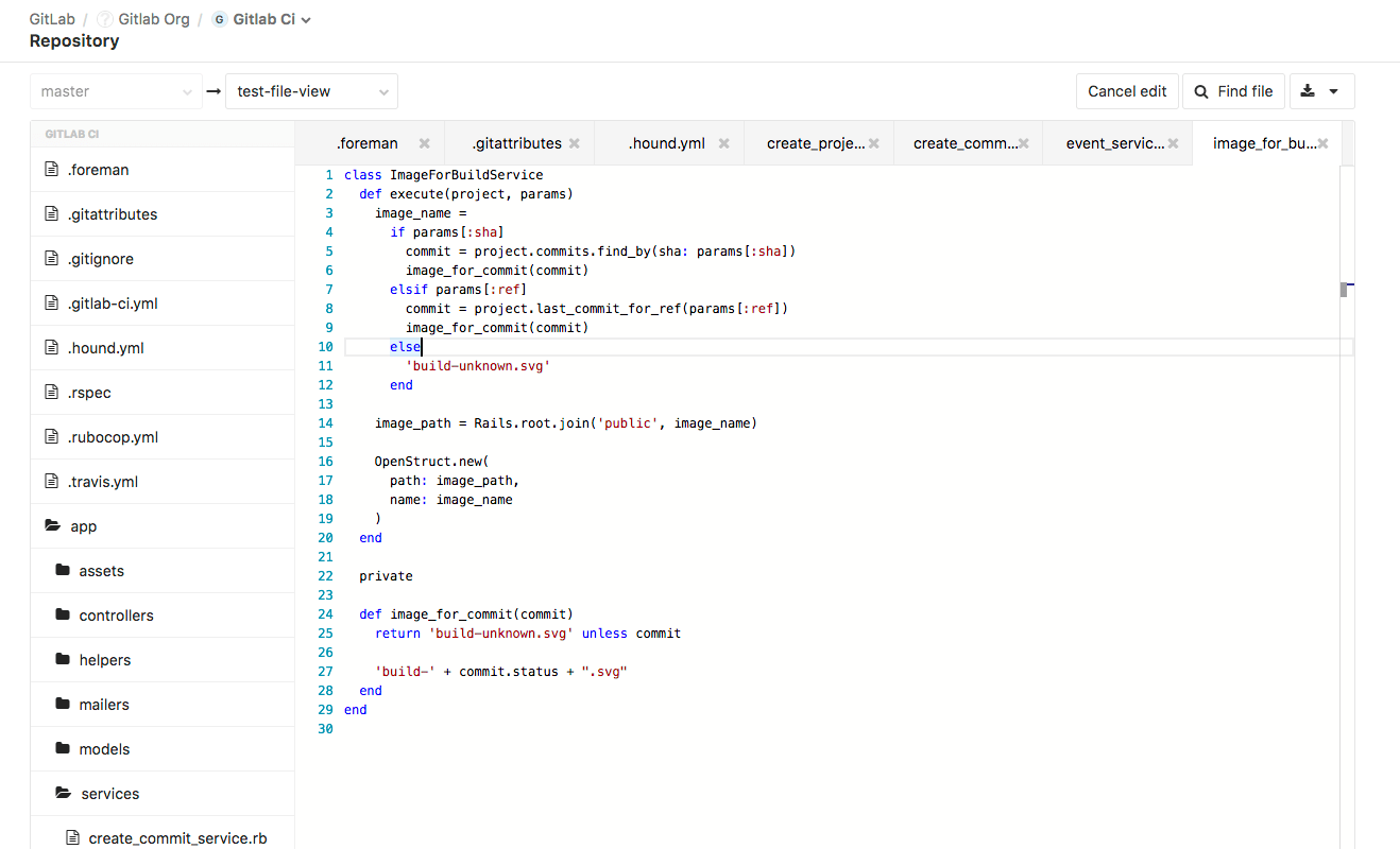
Setting up that proof of concept was a tremendous amount of work and was time-boxed to one month. Jacob also had other responsibilities, and there was still a long way to go from concept to minimal viable product (MVP).
Product, UX, and other developers got involved to see if this could be pushed towards production. The concept solved a problem, but did it align with our vision? How could we holistically integrate this and make it a great experience? How could we get it to perform well for many different users?
The next phase
It took some time, but it was clear that we were aiming for a real integrated development experience, accessible for everyone right within the GitLab UI, without anything to install. The idea grew from the "Repo editor" into that of the "Web IDE."
GitLab itself is open source (or rather open core) and relies on many open source projects for its development. Jacob had already decided that the Monaco editor was the perfect code editor to integrate. It had already proven itself within different contexts, was great for performance, and so could be considered a boring solution.
Our UX manager Sarrah Vesselov did the initial design for the concept after which it got passed on to me. It was up to our platform product manager James Ramsay, our frontend engineering manager Tim Zallman, senior frontend engineer Phil Hughes, and I as the UX Designer to redefine the prototype "multi-file editor" into the foundation capable of supporting our vision of an Integrated Development Environment with live previews and web terminals, that enables anyone to contribute.
Iterating on user experience
An integrated editor
The original "multi-file editor" was about committing multiple changes at once because this was annoying when updating the handbook or docs. Often those changes touched multiple files. It was a prototype that made it easier for people to contribute.
The more we thought about this idea, the greater the possibilities became. One of GitLab's unique advantages is being an integrated product. Building an editor that was integrated with GitLab and made it easier for anyone to contribute is a natural fit. However, the starting point of a prototype in the file list and blob editor wouldn't have been enough to handle this. Decoupling this was the first actionable item.
One of GitLab's unique advantages is being an integrated product. Building an editor that was integrated with GitLab and made it easier for anyone to contribute is a natural fit.
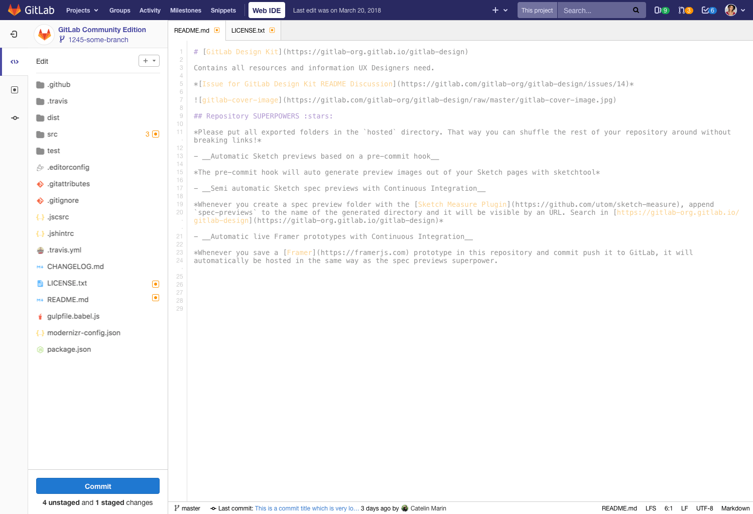
This change, which required a lot of discussion and a considerable amount of engineering work by our developers Phil and Tim, was where the project pivoted towards its new direction. The Web IDE got a lot more screen real estate as it no longer had to make room for the project sidebar and other page elements. We decided that the Web IDE would edit one branch at a time only and conceptualized the initial Git flow into the editor. Based on existing UI paradigms and inspired by other code editors like VSCode and Atom, we arrived at the well-known, three-pane layout.
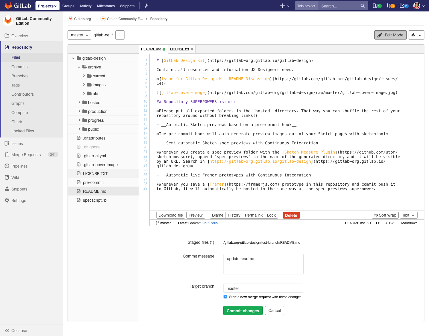
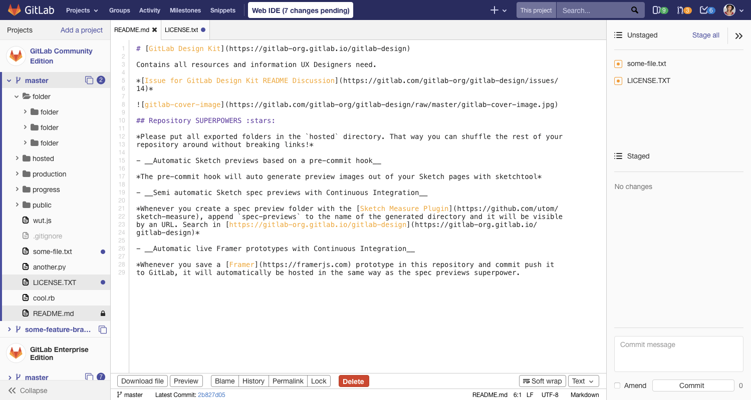
Even seasoned developers were once beginners, and getting new people accustomed to the Git workflow continues to be notoriously hard to tackle. We decided therefore that the core of the Web IDE experience should be stable before we can venture into more advanced concepts. We set out to make the "editing to committing" experience as good as possible and to create a foundation on which we can expand.
Even while having these discussions, development never stood still. We quickly had a working version of the Web IDE that relied on the Monaco editor. Our immediate efforts pushed towards getting that to a functional, viable state.
A review state
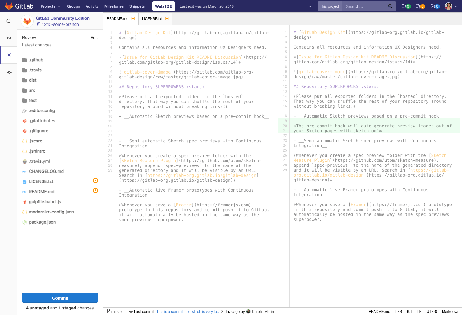
Due to the potency of the Monaco editor, it became clear we had many options to choose from as to what to develop next. A review state was high up on that list, as it should be obvious what you are going to commit. Not only that, it introduced the possibility of being able to have an integrated merge request review experience in the context of the editing experience – something that has not been possible before.
This introduced the problem of managing states. After much discussion, we decided to go for editor states instead of file-specific states. Both the user perspective as well as the technical implementation benefited from this as it reduced complexity. It meant you were either editing your files or reviewing your changes across the files you had opened.
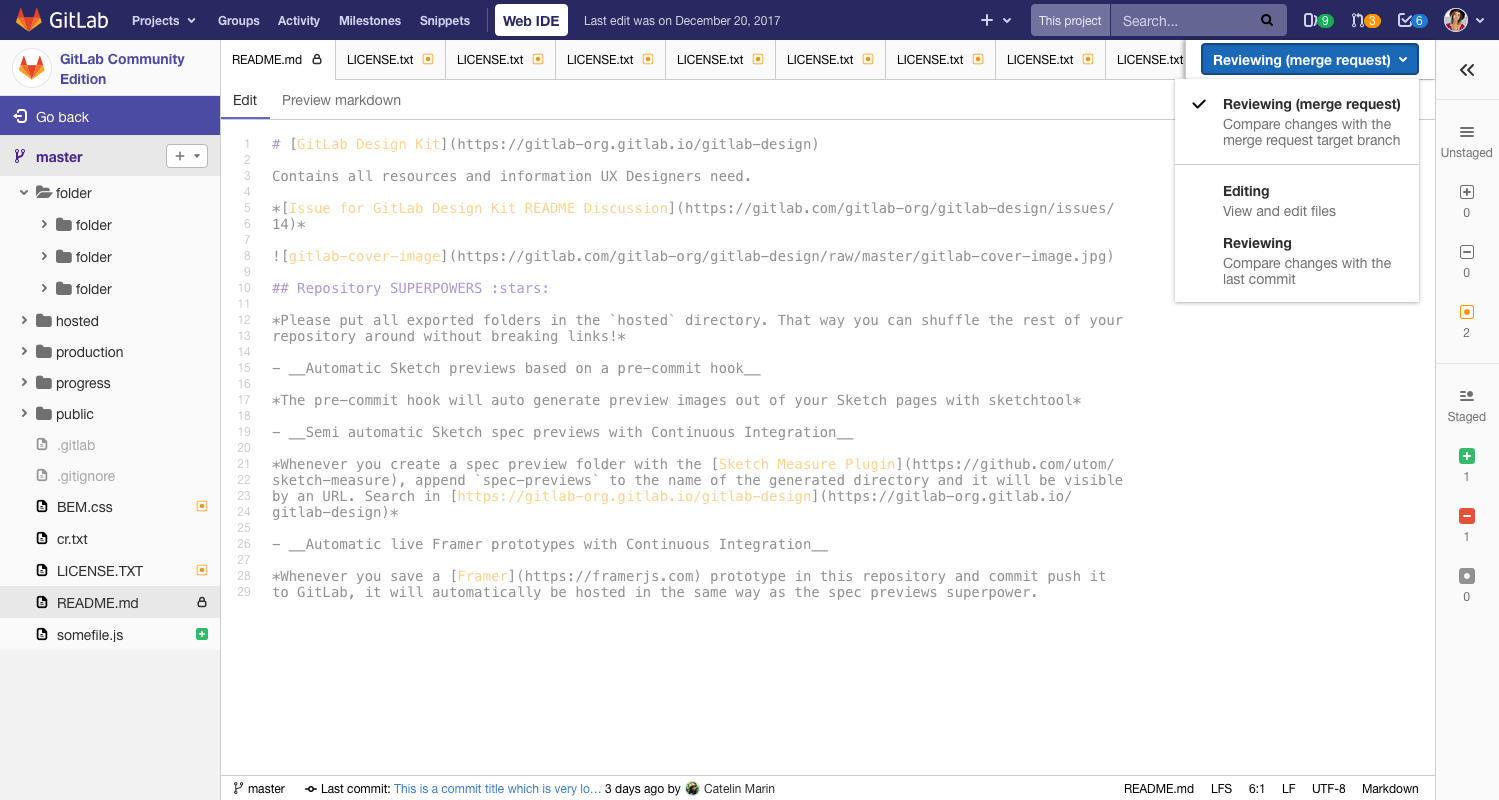
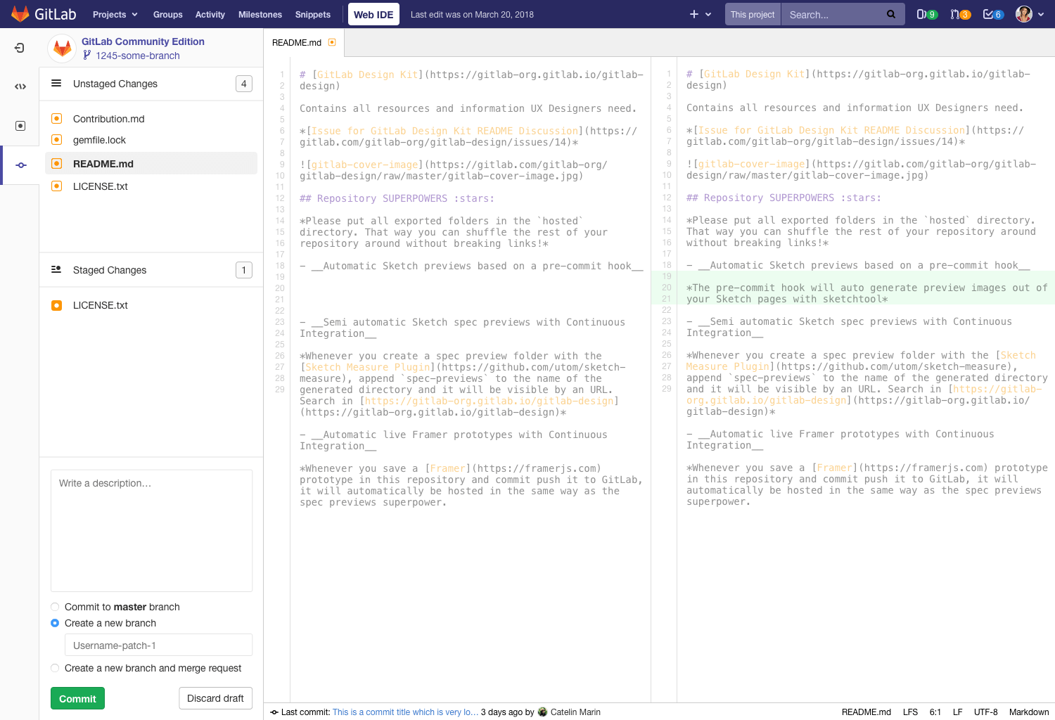
At this point, we are nearing the current state of the Web IDE, though in GitLab 10.8 we could finally realize the "editing to committing" experience that we talked about before and which was conceptualized and prototyped while developing GitLab 10.7. This was made possible as development reached a more stable state.
Deciding on hierarchy
The new experience had several objectives. It needed to introduce a more logical hierarchy for the panes to operate in. Based on that we could decide which panes would potentially show what information and where we could fit in any future more advanced features.
The second objective was to guide the user more intuitively from editing to committing. The editing and reviewing experience up until then showed its shortcomings as it was hard to switch modes and unclear when you were doing a good job. If even seasoned developers had a hard time using it, how could people just starting out ever hope to successfully contribute making use of it? James and I went through many concepts and discussed both flow and hierarchy before getting into detailed mockups. Through the iterations, it became apparent we preferred our hierarchy to act from left to right. We decided we needed a similar paradigm as the activity bar shown in VSCode. The editor became far more usable as state changes were just one click away, regardless of which state you were already using. As committing was now a separate state as well, it brought a linearity to the entire flow as seen from the activity bar.
The last significant detail, which came out of a discarded design iteration, was a button to guide the user towards committing their changes. It introduced a little section at the bottom of each state with a blue commit button and a counter so you can see how many changes you have made – essential as we repurposed the right sidebar.
Interested to see all iterations the concepts have gone through? Check out my Web IDE directory in GitLab's open source design library where we contribute all our design files!
Just the beginning
The current state of the Web IDE is still only the beginning. We are planning for an even better experience in the future: one where we can integrate and support more advanced features, such as a live environment to test your code against and code review discussions which are directly resolvable.
In GitLab 11.0, shipping next Friday, we will already have the following improvements: you will be able to view the latest pipeline status and the job logs directly in context, and you will be able to quickly switch between both assigned and authored merge requests without leaving the Web IDE!
This and more will inevitably lead towards more interesting design decisions to be made. Some of these concepts are uncharted territory and are sure to be valuable to further speed up development and give developers more confidence. Our hope is that this is a valuable contribution to both the open source community as well as GitLab itself.
Do you have great ideas to push this effort forwards or want to contribute yourself? Check out the issue tracker!
We want to hear from you
Enjoyed reading this blog post or have questions or feedback? Share your thoughts by creating a new topic in the GitLab community forum.Share your feedbackFind out which plan works best for your team
Learn about pricingLearn about what GitLab can do for your team
Talk to an expert